- 20 September 2018
- Posted by: Peter Lunio
- Categories: Analytics, Business Initiative, regulator for social housing, RSH, social housing, Social Housing VfM Analysis, value for money
7 mins read.
Given the level of interest that my first article on this topic generated “Housing Associations – are they delivering VfM now and in the future? Part 1”.
I thought I would do a follow this up, but this time I am going to look at the changes in VfM performance from FY16 to FY17 based on our VfM tracker and scoring. Also, in the original article, we identified a core group of associations (10k-3k, LSVT >12 yrs) who we predicted will be the best performers based on the new VfM metrics and I am going to try and provide you with some analysis as to what makes them the best VfM performers.
If you recall, we have we have devised a VfM tracker, based upon the new VfM metrics issued by the regulator. So, this enables us to develop a single score for each English housing association based upon a score of each of the new VfM metrics. Using our unique trackers and scores, we have looked at the historical performance and, utilising our unique IwP Methalytics predictive algorithm, we are able to forecast each association’s future performance.
For this analysis, we will only show the results of our analysis based on a segmentation of the sector based on size i.e. units and type (traditional, LSVT) and we have added location.
So how big has the VfM performance change been from FY16 – FY17?
Our first piece of analysis is a plot of the percentage change in the VfM score for each housing association in our database. This scatter diagram below of all the RP’s shows the distribution of either the % increase or decrease in an RP’s IwP VfM score between FY16 and FY17. It shows the huge range in VfM performance change in just one year alone.
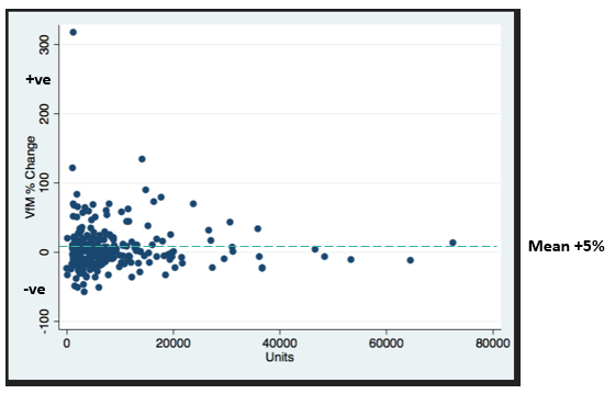
So, we have % changes in our VfM scores ranging from +316% to -58%. One positive point is that the mean at 5% is positive. However, it is a little concerning that in one year there should be such volatility in VfM performance given the level of emphasis that VfM has had over the past few years.
The next graph looks at the size of the range of % change vs the proportion of RP’s in each positive and negative change ranges. So, for example, you can see that 25% of all associations in our database (we have ~ 278 RP’s in our database) had a positive change of between 0-10%. Whilst 12% of RP’s had a positive change in VfM score of over 30 %. What is a little disconcerting is that 95 or 34% of all RP’s in our database had a decline in their IwP VfM score by 0 to -20% in one year alone.

Insight – We were surprised to find that almost a third of RP’s (~80) in England had a change in their IwP VfM scores >20% either positive/negative.
Type
The next piece of analysis looks at the comparisons in type, between the two groups of associations ie those that have shown a positive % change and those that have shown a negative % change in their VfM scores.
| Type | +ve % Change | -ve % Change |
| LSVT’s | 91 (62%) | 51 (40%) |
| Traditional’s | 58 (38%) | 77 (60%) |
| Totals | 149 (54%) | 128 (46%) |
The table above shows that 149 (54% of the total RP’s in our database) showed a positive increase in their VfM IwP score from FY16 to FY17 – the average increase was +22% and 62% of these were LSVT’s.
Whilst 128 associations showed a negative decrease in their IwP VfM scores – the average decrease was -16% and 60% of these were Traditionals.
Insights – Given the focus by the regulator over the past few years on VfM it is a little disconcerting that 46% of housing associations in our database are showing an avg minus 16% change in their VfM scores in one year based on the new metrics, with Traditional’s being the main constituency.
By Size
Our next piece of analysis has been to look to see if there is any influence on the % VfM change by size ie units. As you can see in the graph below there is a fairly even distribution by size across the positive and negative changes. So for example, 28% of RP’s that have shown a positive increase are 3k-10k in size. Further to illustrate a point we made in our Part 1 article – that midsize RP’s tend to be better at delivering VfM, 41% of RP’s <10k have shown a positive increase in their VfM scores in FY17. It is also slightly worrying that the >20k units RP group has slightly more associations showing a negative change than positive when you might expect the opposite.
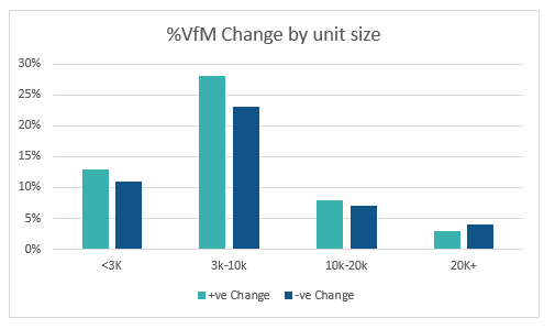
Insight – there appears to be an even distribution between positive and negative changes in our IwP VfM score by size, though it appears that the <10k units RPs are delivering the most gains.
Location.
We have analysed the geographical location of the positive and negative change groups to see if there are any insights to be gained by geography. For example, we have found, see below, that 20% of the RP’s that showed a -ve change were based in the London region. Whilst, the NW had the highest % of positive change RP’s (20%) as well as the second highest negative change RP ’s ( 19%).
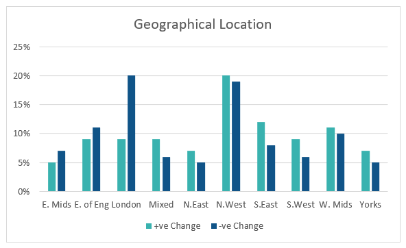
The best region it appears for delivering improved VfM scores is the South East which has the biggest positive gap between positive and negative change.
Insights. The geographical analysis has thrown up some interesting results, with the London region showing the largest proportion of RP’s with a negative VfM change score. This could be because 72% of the RP’s in that region are Traditional’s who we have shown tend to do less well in VfM performance terms. Whilst, in the NW, 62% of the RPs are LSVT’s which tend to do better in our VfM analysis. ( See Part 1 article)
What VfM KPI ‘s have made the Difference?
| Avg of EBITDA % scores change (without sales) | Avg of SHL operating margin scores change
| Avg of Operating Margin % scores change
| Avg of Headline Social Housing CPU scores change
| Avg of Gearing Ratio % scores change
| |
| Avg % IwP score Decrease in KPI | -24% | -16% | -14% | -13% | 4% |
| Avg % IwP score Increase in KPI | 90% | 34% | 35% | 26% | 7% |
We have tried to analyse which of the regulators VfM KPI’s have improved or deteriorated the most. So in the table above the RP’s that have shown the positive change in their overall IwP VfM scores, (the second row), they have done so by significantly increasing their IwP EBITDA and margins scores whilst at the same time significantly increasing their cost efficiency scores ie reduced their costs.
Whilst those RP’s that have shown a negative VFM change in their VfM scores have shown a significant decrease in their IwP EBITDA, as well as margins scores as well as a reduction in their cost efficiency scores ie cost have gone up.
How do you consistently deliver VFM?
If you recall in our previous analysis, we identified the sector group that has consistently delivered, and we predict will continue to deliver VfM relative to the sector. They were those RP’s between 10k-3k units and LSVTs>12 years. We have analysed which of the IwP VfM KPI scores that have improved the most over the past 5 yrs.
| Avg of EBITDA % scores change (without sales) | Avg of SHL operating margin scores change
| Avg of Operating Margin % scores change
| Avg of Headline Social Housing CPU scores change
| Avg of Gearing Ratio % scores change
| |
| Average % 5-year IWP score increase in KPI’s | 21% | 45% | 10% | 13% | 12% |
The table above shows that the ones that have improved the most avg. over 5 years, – are SHL operating margin and EBITDA scores driven by reducing costs. This has enabled them to deliver improvements in their operating margins. This group appears to have found a formula that consistently delivers these high average improvements in their IwP KPI scores for these metrics. This formula I guess will come as no great surprise, the problem I guess is doing it in practice consistently.
Overall Thoughts.
Given the amount of heat and light that has been focused on VfM by the sector over the past few years, we were surprised given the analysis in my articles in Part 1&2 the extent of divergence and variation there has been in VfM performance based on the new metrics, which are principally aimed at measuring financial and development performance and therefore probably reflect that.
So maybe it’s not strange that LSVT’s are performing better in terms of VfM than Traditional’s, what we had not anticipated was the extent of % VfM change in a year?
As we have stated before, we recognise that assessing and measuring VfM is still a challenge. But given that the regulator has identified the metrics in how it measures VfM in the sector. The challenge is clear for the 128 RP’s who posted a negative change in their VfM scores there is for some much work to be done and as we have identified, the improvement formula is reasonably straightforward, the delivery clearly is not so.
Based on our VfM rating scheme we have ranked each individual English association based on their average historical VfM performance. If you would like to know where your association stands in our Platinum/Gold/Silver/Bronze performance ranking, then email your details to my address below.
peter.lunio@iwp-uk.com
If you would like to know how your association performs in relation to VfM and our other unique performance trackers on Business Health, Cost Efficiency, Staff Productivity and our Overall Performance Rating of your Association then please go to our website or contact me directly.
Error: Contact form not found.